Ruminations on Liminal UX
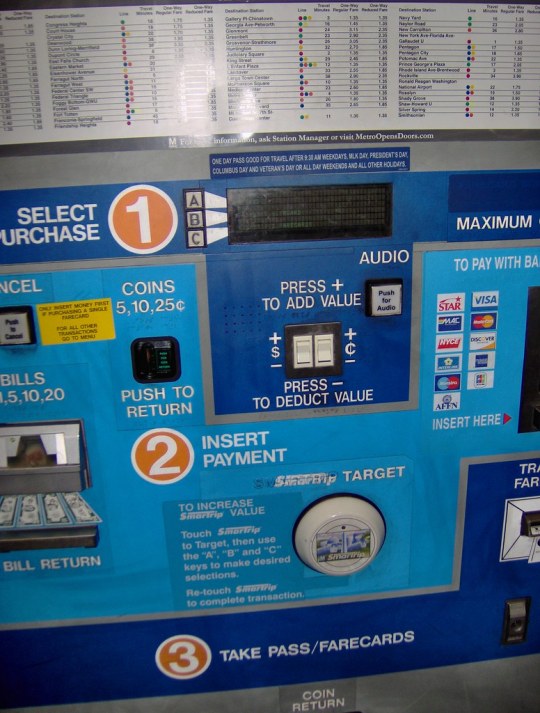
Over the past few years, I’ve been thinking a lot about liminal experiences in user experience. Liminality defines the transitional states between experiences. å A place where service design & user experience are falling short is thinking about the areas where experiences (both experiential and transactional) and interactions that were once human to human (like cashier purchases or customer help lines) are now being delegated to screens or chatbots. 
I think of kiosks and chatbots as liminal, because the friction that using non-human interactions introduces to customers that didn’t exist previously. (And yes, I realize that self-checkout lanes cut down on long lines. But how many times have you seen long lines to self-checkout, like we used to see on “express” lanes?)
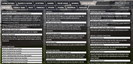
But there are a whole range of UIs that pervade everyday life from video games to transit kiosks that lack the care, attention, and design detail that we apply to slick apps on phones. 
I’m convinced the design problems that pervade these frequently used, but poorly designed experiences isn’t entirely about neglect. It’s a lack of attention and care. Whose job is it to care about these transition states? Why should you spend “the company’s money” designing a more thoughtful user interface for say, a video game? 
Just because users will put up with something, doesn’t make an experience worth probing. I’m going to spend some time next month, thinking more on this subject. Is it liminality or something else? How do you create experiences that are repeatable and transferable across platforms? Is there a way to conjure design systems for the UX of experiences inside the public domain (like transit) or agitating for better customer experiences for transactional UI?
I’m going to be keep noodling on this subject. Feel free to DM if you want to chat about it.